
Be sure to read Part One of this article first.
At the risk of sounding like the narrator on “The Rocky and Bullwinkle Show,” we last left off with the story of Green Tiger Press (Part 1), my trip to the venerable publishing house in La Jolla in 1987. At the funky and magical Green Tiger Press publishing house, I loaded up on greeting cards, bookplates, and books illustrated with art from pre-1940 children’s books. The owners, Harold and Sandra Darling, had published a bestselling book, A Book of Unicorns, in 1978, ten years after Peter S. Beagle’s famous novel, The Last Unicorn, and light years before the current unicorn craze.
Most of their eclectic products were based on Harold Darling’s treasure trove of 20,000 antique illustrated books and 100,000 pieces of vintage ephemera. Darling, whose became interested in children’s books at age 21, once remarked, “Old books mean so much to me, it’s like receiving something and passing it along. The difference at Green Tiger is that we emphasize visual books, that is our whole focus … Life cannot be properly looked at without the help of picture makers, for they find those moments which allow us to look at existence.”
Despite the patronage of university students, people interested in art, and those drawn by the general quirkiness of the place, Green Tiger Press struggled financially, partly because of the Darlings’ somewhat chaotic business model, and partly because of their ideals. “We deal in play things, ornaments, tools for the imagination,” Harold Darling said. “[Like peddlers] we sell baubles, memories and fabric for dreams. Our preference for both story and image is for the romantic, the dreamlike, or the visionary. We strive for perfection.”
Perfection was a hallmark of the operation. Green Tiger Press manufactured their own products with an offset two-color press. Colors were studied carefully. Colin Kerr, the printer, believed women saw yellow better than men, and older people detected yellow and red less than when they were younger. “Yellow,” Kerr once said, “is a really important color … a lot of grays need the yellow. People don’t think yellow is important.”
People don’t think that hand-tipped color plates are important, either. But that process, borrowed from turn-of-the-century gift books, especially set Green Tiger Press apart. In the early 1900s books often had color illustrations hand-glued along the top edge onto a blank page. Harold Darling kept this tradition: “We intend homage and evocation by our use of this method. We restore an element of hand production and human care to the excessively mechanized art of the book.”
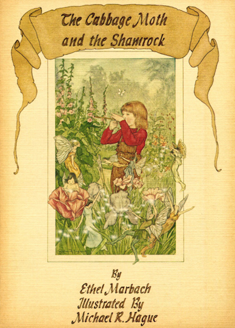
Besides using vintage artwork, the owners also cultivated writers and illustrators. Cooper Edens submitted a one-page manuscript for If You’re Afraid of the Dark, Remember the Night Rainbow, along with a poor color Xerox of one of his illustrations. The text of his children’s book read: “If tomorrow morning the sky falls … have clouds for breakfast.” The accompanying art depicted a bowl of clouds. The 1979 book became a bestseller for Green Tiger Press. Edens wrote and illustrated other books, such as The Starcleaner Reunion. In 1990, the press published The Sky Jumps into Your Shoes at Night by Jasper Tomkins. Michael Hague got his start as a Second Golden Age Illustrator with The Cabbage Moth and the Shamrock (1978). What kid wouldn’t want to dream their way into books with such evocative titles?
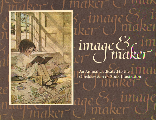
One of the books I snatched up on my 1987 visit is the 1984 Image & Maker: An Annual Dedicated to the Consideration of Book Illustration, a collection of illustrated essays. I bought the book because the cover sported a hand-glued color plate by Jessie Willcox Smith, my favorite Golden Age Illustrator, and contained Carolyn Haywood’s essay on Smith’s life. On re-reading the Image & Maker recently, I found myself intently involved in Perry Nodelman’s essay, “How Picture Books Work.” It begins: “Pictures in [children’s] books are rarely simple, and need not be colorful or non-abstract.” Whew. Cooper Edens’ cloud-filled cereal bowl passes the test.
Nodelman’s essay isn’t so much about how picture books work as how the art is read. I’ve been examining children’s illustrations since I was seven and pored over the little pull-out calendar in Woman’s Day for the year 1959. Illustrator Erik Blegvad created those calendars annually. His ink and watercolor drawings were so precise and detailed, I could walk around those miniature scenes, looking for the black kitten that was always there. From then on, I recognized Blegvad’s work in children’s books and he became my first favorite artist.
As a young child, I never saw a true picture book, not counting my few Little Golden Books (even then I was picky about the strange art in The Poky Little Puppy). Nodelman compares two books I own now: Snow White illustrated by Trina Schart Hyman, and Snow White and the Seven Dwarfs illustrated by Nancy Ekholm Burkert, two artists who often portrayed the same scenes. Nodelman says: “The different ways these pictures make us feel about the same information is a matter of the illustrator’s style — not what is depicted, but how it is depicted. Style is interpretation.” Which is why I didn’t like the look of Tenggren’s puppies.
I read this essay three times, concentrating on Burkert’s scene of Snow White running through the woods and finding the animals hidden in the foliage. As Nodelman says, “Our close attention to visual details is repaid by a deeper and more objective understanding of the events.” I used to prefer Hyman’s version of this story. Now I see the virtues of Burkert’s. As far as I know, this is the only Image & Maker annual by Green Tiger Press and we are the poorer for it.
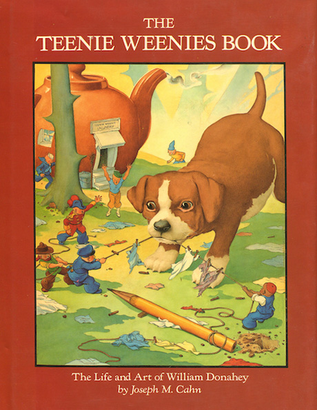
I was lucky to be at Green Tiger Press when they had just published The Teenie Weenies Book: The Life and Art of William Donahey. Donahey produced a syndicated newspaper comic from 1914 to 1970. The adventures of two-inch tall people who lived under a rose bush yet managed to go everywhere tickled both kids and adults. The Teenie Weenies appeared in magazine advertisements and in stand-alone books. The Green Tiger Press edition is rich with images and a thorough exploration of Donahey’s life.
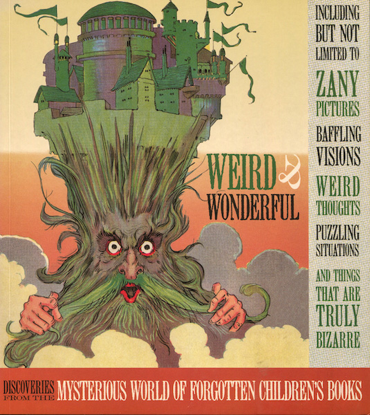
My newest Green Tiger Press book is by Welleran Polternees (Harold Darling’s pseudonym), published by Darling and Company in 2010. In Weird & Wonderful: Discoveries from the Mysterious World of Forgotten Children’s Books. Weird and wonderful artwork fill more than one hundred pages, each image stranger than the last.
When I was there in 1987, the company had already sold the company the year before. The new owner in turn sold it to Simon & Schuster in 1990. In 1993, the Darlings created Laughing Elephant to produce gift books and paper products. Harold Darling still had his storehouse of antique ephemera and his huge library. Blue Lantern Studios, another offshoot, designed and produced books for other publishers.
At some point S&S abandoned the imprint. The Darlings took back the trademark and began reissuing backlist titles in 2003. In my research, I’ve come across Star & Elephant Books, Laughing Elephant Books, Blue Lantern Studio Books, and Darling and Company Books. They are all the brain-children of visionaries Harold and Sandra Darling, and are in some incarnation or another of Green Tiger Press. Harold died in 2016. Sandra runs the gift division of Laughing Elephant. Son Benjamin manages the book division. Their latest bestseller is Everything I Need to Know I Learned from Led Zeppelin. Sigh.
But … the backlist is still available and I’m drooling over Jasper Tomkins’ 1981 The Catalog, about three mountains that just sit (what else can mountains do?) until a catalog arrives. The mountains order giraffes, turtles, and bears. Then they order refrigerators full of food for the animals, playing cards (animals get bored), records and a record player so the animals can dance.
I count myself lucky that I made my husband find Green Tiger Press in that hilly La Jolla neighborhood. Besides the books, I have most of the greeting cards still sealed in cellophane envelopes and bookplates, along with memories of a pink stucco building. Inside, a green carousel tiger, the quote “Children see magic because they look for it” by Christopher Moore painted on a wall, and perfection disguised as dreams.