
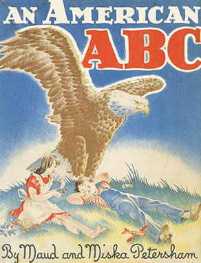
The first alphabet book to win a Caldecott Award was Maud and Miska Petersham’s An American ABC. It received a Caldecott Honor in 1942. Historical in theme, it features highlights of early America through symbols, places, and people. Like many books published during and after World War II, it is patriotic, but not totally accurate or culturally sensitive by today’s standards. For example: “C is for COLUMBUS….who was born before America was known.” (Known by whom?) Also, “R is for REDSKINS.” Illustrations of African Americans and indigenous people are stereotypical.
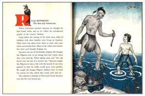
Arranged alphabetically, but not chronologically, (L is for LINCOLN comes before M is for MAYFLOWER), each letter is displayed in either red or blue on the verso with a story about the word it represents. Full color single-page illustrations alternate with black and white illustrations highlighted in blue and red on the recto. The pencil and watercolor art is an example of pre-separated art “for which the areas to be printed with different colors of ink are manually separated by the artist before being sent to the camera person to prepare for printing” (The Kerlan Collection of Children’s Literature).
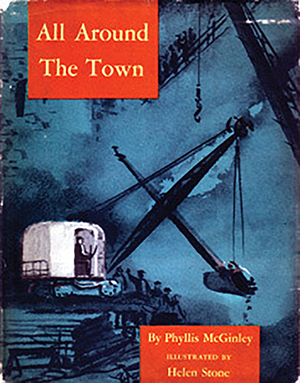
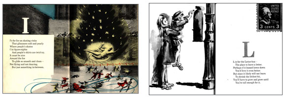
A second thematic early alphabet book, All Around the Town by Phyllis McGinley and illustrated by Helen Stone, won a Caldecott Honor in 1949. The watercolor illustrations are another example of pre-separated art with four-color illustrations alternating with black and white illustrations. Though the scenes are neutral or even cheerful, they appear dark, sometimes somber, due to heavy use of dark tones.
Rhyming poems follow each letter of the alphabet, usually incorporating alliteration with the initial letters of the featured words. Those words refer to people, places, or experiences one might have in a city such as riding a subway, encountering a police officer, or observing an excavation. While it could be any city, Stone has chosen New York City with the ice skating scene in front of the Prometheus statue at Rockerfeller Center.
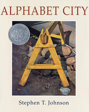
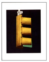
A more recent thematic alphabet book about the city is Stephen T. Johnson’s Alphabet City that won a Caldecott Honor in 1996. The photorealistic paintings, created with “pastels, watercolors, gouache and charcoal on hot pressed watercolor paper” (Johnson, 1995), focus on the letters themselves with no printed words to accompany the illustrations. In fact, the letters have no association with the object in which they are found other than the fact that they either look like the letter or the letter can be found within the object. For example, a stoplight does not begin with the letter E, though from the side, the stoplight resembles the letter E.
Johnson describes the parameters for his illustrations in his author’s note. “All letters had to be capital letters, found in their natural positions, out-of-doors or in public spaces such as the subway, readily accessible to anyone who looks carefully at our urban world at various times of day, and during the cycle of the seasons” (Johnson, 1995). The paintings capture all the seasons: the O forms the support railings on a park bench in the snow, and the R is located in the cracks of a sidewalk littered with autumn leaves. The white framing of each painting adds to the photographic impression.
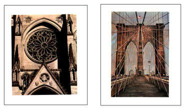
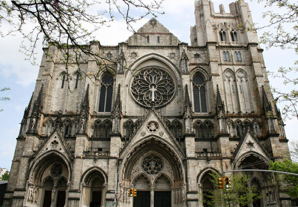
Johnson lives in Brooklyn, New York, and it is easy to see from his letters C and M that the city he paints is New York City because the C depicts the rose window in the Cathedral of St. John the Divine (minus the cross statue), and the M is definitely the iconic Brooklyn Bridge with the suspension cables and the waving flag.

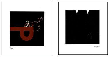
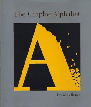 The following year David Pelletier also required readers to examine and intrepret illustrations in The Graphic Alphabet to see how the letters represent the printed words. In some cases, this is easy, such as the P for Pipe. In other cases, it is less obvious, as in V for Vampire in which two letter Vs represent the vampire’s teeth.
Pelletier won the 1997 Caldecott Honor for his creative vision of the alphabet. His graphic design background is reflected in the clean, square format of the book and the illustrations that he creates digitally. The author’s note indicates that “the illustration of the letterform had to retain the natural shape of the letter as well as represent the meaning of the word” (Pelletier, 1996). In order to do this, sometimes the letters are capitalized, and sometimes they are lower case. They may be tilted or rotated to meet requirements. Black backgrounds within white frames make the colorful letters pop.
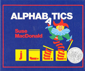 In her first book, Suse MacDonald won a Caldecott Honor in 1987 for Alphabatics, another whimsical potpourri alphabet book. Using bright colors against stark white backgrounds, MacDonald’s letters on the verso twist and turn like acrobats to evolve into labeled objects or animals on the recto. A two-page spread is devoted to each letter presented in uppercase and lowercase sans serif type. The cleanly designed illustrations are flat, but vibrant with humor and movement.
“Alphabatics is an idea that came to me while taking topography in art school. In the course, I worked exclusively with letter forms, shrinking and expanding them and manipulating their shapes in various ways. I was intrigued by the process and felt there were possibilities for a book” (MacDonald, 2022). MacDonald’s uncomplicated letter transformations encourage her readers to stretch their imaginations.