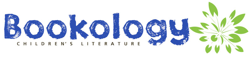
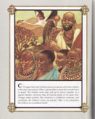
 The first theme is African culture. In 1975, Jambo Means Hello: Swahili Alphabet Book won the Caldecott Honor. Written by Muriel Feelings and illustrated by her husband Tom Feelings, they chose the Swahili alphabet because this language is “spoken across more of Africa than any other language.” It is the official language of the African Union, and its official name is Kiswahili. However, for simplicity’s sake, Feelings refers to the language as Swahili (Feelings, 1974, Introduction). It is spoken by over 200 million people and is one of the world’s ten most spoken languages. Though this book is almost fifty years old, the importance of the language was recently recognized by the United Nations when they declared July 7, 2022, as World Kiswahili Day (UNESCO, 2022).
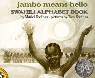
The illustrations extend the meaning of the words and provide context. Feelings uses black ink, white tempera, and linseed oil on textured board. A detailed description of his process is provided in “A Note about the Art” in the back of the book. In reproducing the art, it is photographed twice using a method called double-dot. The first photograph includes all the art and is printed in black ink. The second photograph includes only part of the art and is printed in the color ochre, a sort of brownish-tan clay color. “The second color is not obvious in the final book, but has the effect of enriching the reproduction and maintaining the strength, subtlety, and warmth of the original art” (Feelings, 1974, A Note about the Art). The only other colors in the book are brown in the African map showing the countries where Kiswahili is spoken and green letters of the featured alphabet word.
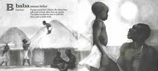
Another book about African culture won a Caldecott Honor in 1977, just two years after the Feelings’ book. With Ashanti to Zulu: African Traditions, Margaret Musgrove presents 26 different African groups and their traditions and customs. Leo and Diane Dillon created the art for this book in pastels, watercolors, and acrylics. “In order to show as much as possible about each different people, in most paintings they have included a man, a woman, a child, their living quarters, an artifact, and a local animal, though in some cases these different elements would not ordinarily be seen together” (Musgrove, 1976).
Musgrove lived and studied in Ghana and did extensive research to create correct portrayals of the variety of people found in Africa. The Dillons did further research to render accurate illustrations. A map on the last page of the book shows where all the various people live on the African continent.
Each alphabet letter presents a different ethnic group on a separate page: A for Ashanti, B for Baule, and C for Chagga. The pages follow the same formal pattern with the illustrations placed above white text blocks. Text and paintings are framed by parallel black and gold lines separated by white space. The black and gold lines are connected at the corners with Kano Knots which symbolize “endless searching — a design originally used in the then-flourishing city of Kano in northern Nigeria during the sixteenth and seventeenth centuries” (Musgrove, 1976). The framing makes each illustration discrete and separates the unique people and their customs rather than lumping together all Africans.
As husband and wife, the Dillons illustrate together, handing work back and forth, so it is not done by one or the other but by what they call the “Third Artist.” Their work is sometimes described as “decorative realism” (Haber, 2020), but Leo Dillon said, “We gave away our separate styles [with the Third Artist], and in doing so realized that we opened ourselves to every style that ever existed on the face of the earth. We try to fit our style to the story that goes with it” (TeachingBooks, 2005).
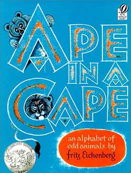
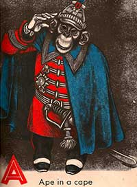
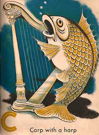
Ape in a Cape: An Alphabet of Odd Animals won a Caldecott Honor in 1953. Fritz Eichenberg dedicated the book to his son Timothy and his friends, the fox and the hare that appear with Timothy on the dedication page illustration and also in the book.
His son, who was five at the time, watched him while he was creating the illustrations. Though known as a master of wood engraving, the illustrations are not woodcuts. The illustrations are actually a monotype medium. Eichenberg described the process in an interview. “The monotype, as the name indicates, it’s a one-shot proposition. You can paint on a piece of glass with printing ink, or with oil paint, or even with gouache and put a piece of paper on top of it, and rub it, rub the back, and you come up with an image. It’s a rather primitive technique. But it allows you tremendous freedom, and you can work with great speed” (Brown, 1980). Due to the expense of printing in full color at that time, his editor requested that he do color separations. So he did. “.…there were three colors each, three times 24, color separations, in black on acetate. It’s a kind of lithographic technique, and they look like color lithography, actually” (Brown, 1980).
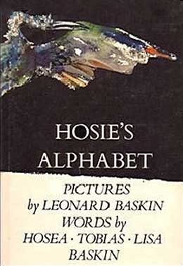 Perhaps more imaginative than Ape in a Cape is the Baskin family’s Hosie’s Alphabet. Though most of the letters signify real animals, four do not: The “D is for demon,” “G A ghastly garrulous gargoyle,” “U The invisible unicorn,” and for some reason, “X The dragon of the alphabet.” Leonard Baskin illustrated creatures selected by his then three-year-old son Hosie, and Hosie’s brother Tobias and mother Lisa supplied the elegant adjectives, truly a family endeavor.
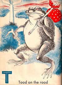
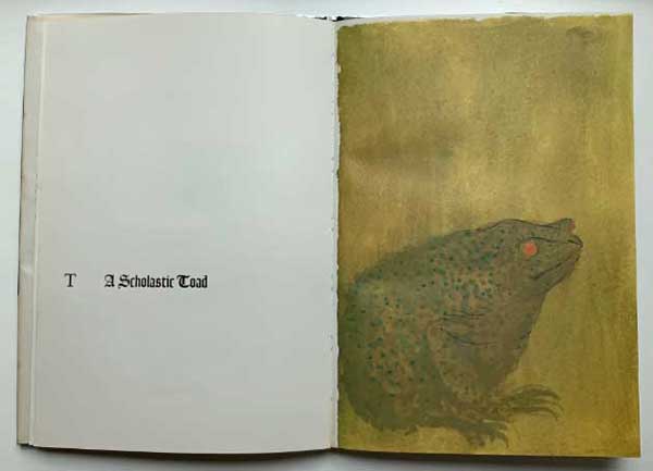
The striking watercolor and ink illustrations captured a 1973 Caldecott Honor. The wraparound jacket portrays a fancifully colored heron in flight while the “H Hosie’s heron” shows a staid, standing blue heron. The eagle and whale fill double-page spreads, but the rest of the creatures appear on the recto pages with letters and words facing on the verso. No context is provided in the illustrations as the backgrounds are either colored or white negative space. Fonts vary in size, style, capitalization, and placement on the page without any apparent pattern or reason. Exceptions include the “F A furious fly” in a very tiny font to describe the lone small fly on the facing page, and the “R The rhinoceros express” in a huge font. The “T A Scholastic Toad” appears in a gothic font, but there isn’t anything particularly scholarly about the illustration of the toad. A young child might not focus on the typography, but it certainly adds interest.
The realistic paintings depict common animals and some uncommon animals, such as the kiwi and zebu, not ordinarily found in alphabet books. Baskin followed this unique alphabet book with the equally delightful Hosie’s Aviary (1979), Hosie’s Zoo (1981), and Book of Dragons (1985), all assisted by Hosie.
Contributions by Hosea, Tobias, and Lisa Baskin. Published by Viking Children’s Books, 1972.
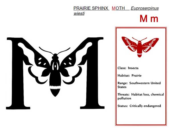
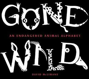 The final book has an animal and environmental theme. David McLimans won a Caldecott Honor in 2007 with his illuminated letters in Gone Wild: An Endangered Animal Alphabet. The status of the featured animals range from vulnerable to critically endangered, and some are familiar, such as the spotted owl, while others, such as the spotted-tail quoll, are less familiar. All are partially incorporated into the form of the alphabetical letter that begins its name, one letter for each page.
Published by Bloomsbury USA, 2016.
Published by Bloomsbury USA, 2016.