
interview by Vicki Palmquist and Marsha Qualey
 The illustrations in The Firekeeper's Son are all double-page spreads. How did that design decision affect your choices and work?
I decided on the format because the landscape is an important part of the story. The original dummy I made had fewer pages so I split many spreads into smaller images. Fortunately, my wonderful editor recognized the problem and allowed me to make the book 40 pages instead of 32, so I could spread the story over 20 spreads. We both felt the expansive double-page spreads helped make the story feel bigger.
My favorite spreads are on pp. 24-25 and pp. 30-31. Similar in palate and subject, one (pp. 30-31) is effectively a close-up of the other (pp. 24-25), and that helps so much to heighten suspense at a critical moment. Did this image come quickly or was it reached slowly?
My favorite sequence of spreads is between pp. 24-25 and pp. 30-31. This is the climactic moment in the text, and Linda Sue expertly builds the climax to Sang-hee’s moment of decision. The sequence of images took a long time to get just right (most of my ideas come V E R Y slowly) I drew and redrew these 4 spreads many times so I could find just the right way to show how Sang-hee decides to put aside his desire to see soldiers (as shown in the shadow on pp. 24-25) to the moment where he lights the fire.
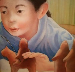 The toy figures Sang-hee plays with are a crucial element in the narrative, yet they’re not mentioned in the text. When and how did they become part of the story?
As an illustrator, my job is to bring something new to the text. The text says that Sang-hee loves soldiers and I wanted to show his interest in a way that young readers could understand. I watched my own son, who was Sang-hee’s age, when I was illustrating this book. He spent a lot of his time making Lego® figures and playing with them, so I started wondering what the 17th century equivalent was to Lego® and came up with the idea of clay soldiers.
Sang-hee plays with clay (or mud) soldiers. Did you find examples of these in your research? How do you go about making sure those toys were in use during the time period in which the book is set?
Children didn't have toys in the small Korean villages and any that they made would not have survived, however I spoke to a curator at the Asian Art Museum and he suggested that children might have fashioned simple figures out of mud or clay. The actual soldiers were made by my 6-year-old-son so they looked like something a young boy would make.
Where did you do your research to find the uniforms Korean soldiers would have worn during this time period? They seem to have reflective rivets on their jackets. Is this something you could detect from your research?
I love the research part of the process. San Francisco has a wonderful Asian Art Museum and I was able to go behind the scenes and look at some of the soldiers' actual uniforms. The museum also provided me with tons of visual reference for all the costumes in the book. The reflection in the rivets actually represents sparks from the 2nd coal. I wanted to visually blend reality and fantasy.
Did you use models for the people in your paintings?
I do use models. My son's best friend posed for Sang-hee, and his mother posed as well. I find one of the hardest parts of painting the illustrations for a book is making the characters look consistent. It helps me if I find a real person to pose.
Do you remember making a decision to paint Sang-hee’s imagined soldiers within the fire?
The text does say he saw a huge battle in the flames, so I was inspired by the text. One of the things I loved about the story are the levels of complexity, and yet the writing is spare. Linda Sue touches on so many themes—family, duty, desire—within a simple text that I had lots of opportunities to expand the story with the art.
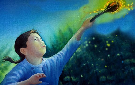
You achieve a wonderful luminescence with your fire. How did you accomplish this?
I worked with a combination of watercolor and liquid acrylics. The acrylics are incredibly intense colors so I watered them down and painted in dozens of layers. My studio now has a big blue-green stain right near the door, because I pinned the painting to the door, wet them with a spray bottle and literally poured paint over them. All the excess dripped onto the floor. It created a nice welcome mat!
The color palette for the paintings is blue, green, and purple, with a beautiful light suffusing the landscape. What led you to decide on that group of colors?
I chose the colors to contrast with the warmth of the fire. I usually do extensive color studies so I can work out not only the colors in the individual spreads, but also how the colors affect the story arc.
Many illustrators paint in watercolor, but you’ve added pastel crayons. What do you feel this adds to a painting?
I love painting with watercolor. The transparency you can achieve with the medium was perfect for the book. However, sometimes I wanted a better dark, a lighter highlight, or a different texture, so adding pastel and colored pencil allowed me to do this.
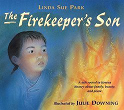
The cover is not taken from pages already existing in the book. It stands separately. What did you feel needed to be on the cover in order to draw people into the book?
I find covers to be challenging. I want to convey a sense of the story without giving anything away. The editor and I went back and forth on showing soldiers in the flames because we were worried it might reveal the ending. Finally, we decided that if they were subtle, it just adds to the mystery of the story.