Black and White

One won­ders why artists con­tin­ued to illus­trate pic­ture books in black and white when print­ing in col­or was an option. Black and white pub­li­ca­tions can be less expen­sive than col­or, but black and white has many oth­er ben­e­fits. “Black-and-white illus­tra­tions pro­vide us with a chance to focus on visu­al ele­ments such as lines, shape, tex­ture, and com­po­si­tion as well as how the artist arranges these ele­ments on the page for the desired effect” (Horn­ing, 2012, p. 10). Sev­er­al Calde­cott Award win­ning illus­tra­tors have employed mono­chro­mat­ic palettes to cre­ate strange, mag­i­cal, and mys­te­ri­ous dream­scapes, some­times in cin­e­mat­ic style.

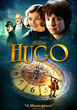
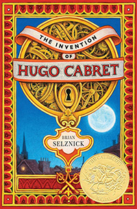
Of The Inven­tion of Hugo Cabret, (Calde­cott Medal, 2008), author/illustrator Bri­an Selznick said, “I want­ed to cre­ate a nov­el that read like a movie (Selznick, 2008, p. 11). At 534 pages, it looks more like a nov­el than a pic­ture book, yet the almost 300 illus­tra­tions con­vey as much of the nar­ra­tive as the text. 

Since this is a book about the cin­e­ma, Selznick said, “… it seemed to make sense to use pic­tures rather than words, to tell the sto­ry in the man­ner of silent movies” (Carey, 2008, para. 7). The full-col­or book jack­et con­trasts with the black-and-white illus­tra­tions with­in the book.

Hugo the movieSequenc­ing of the illus­tra­tions as well as the zoom­ing effects uti­lize cin­e­mato­graph­ic tech­niques. (See slide show exam­ple here.) Every page has a black bor­der like a film frame. Work­ing under a mag­ni­fy­ing glass, Selznick’s draw­ings start­ed out very small, only 3” x 5” (Carey, 2008, para. 8). The black and white pen­cil illus­tra­tions (ALSC, 2020, p. 108) were then enlarged adding grain­i­ness and reveal­ing the cross-hatch­ing that cre­at­ed tex­ture and shad­ing. This also blurred the lines, soft­en­ing the con­trast, and lend­ing an atmos­pher­ic qual­i­ty to evoke the 1930’s set­ting. The movie “Hugo” based on the book met with much acclaim and won five Acad­e­my Awards (IMBd, 2011).

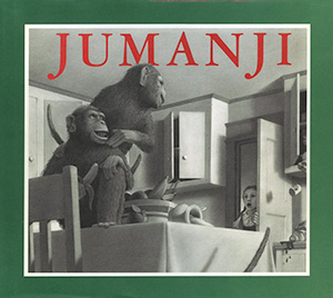
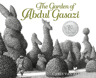
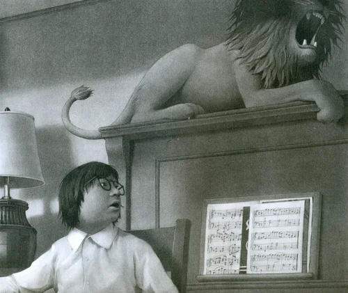
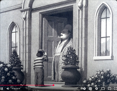
Author/illustrator Chris Van Alls­burg also thinks of movies when mak­ing his pic­ture books. “I … see the sto­ries I cre­ate play out in my mind’s eye a bit like a film” (Van Alls­burg & Heller, 2004, p. 52). Not sur­pris­ing­ly, his book Juman­ji (Calde­cott Medal, 1982) was made into a movie, and the movie rites for Van Allsburg’s first book, The Gar­den of Abdul Gasazi (Calde­cott Hon­or, 1980), were pur­chased by Fox/Disney in 2019 (Flem­ing, 2019).

Van Allsburg’s mas­tery of light and shad­ow, achieved through the tech­nique of chiaroscuro, con­trast­ing light and dark with light bright­en­ing one side of an object while the oth­er side is dark­ened in shad­ow, gives his some­what for­mal pho­to­graph­ic illus­tra­tions a feel­ing of three dimen­sions. Pen­cil and the grind­ings from the pen­cil rubbed with cot­ton (McElmeel, 2000, 487) cre­ate soft vel­vety tex­tures and dif­fer­ing val­ues that make the sur­re­al­is­tic illus­tra­tions of Juman­ji appear real­is­tic. Dra­mat­ic and vary­ing per­spec­tives mim­ic cam­era angles of film in both books. Whether it’s a game com­ing to life or a magi­cian turn­ing a dog into a duck, Van Alls­burg makes the impos­si­ble seem pos­si­ble in strange and mys­te­ri­ous ways. He is quot­ed as say­ing, “The idea of the extra­or­di­nary hap­pen­ing in the con­text of the ordi­nary is what’s fas­ci­nat­ing to me” (Wynne-Jones, 2007, p. 61).

Jumanji by Chris Van Allsburg
The Garden of Abdul Gasazi by Chris Van Allsburg

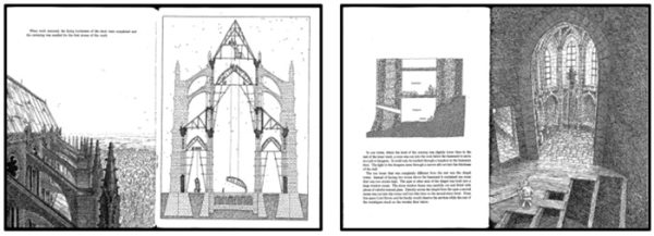
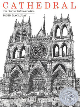
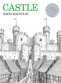
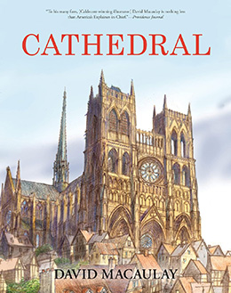
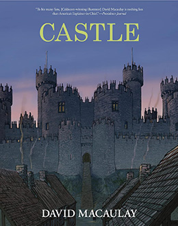
Lack­ing some of the mys­tery or dream­like qual­i­ties of the pre­ced­ing books, David Macaulay’s Cathe­dral: The Sto­ry of Its Con­struc­tion (Calde­cott Hon­or, 1974) and Cas­tle (Calde­cott Hon­or, 1978) are a strik­ing con­trast. The stark and extreme­ly detailed pen and ink draw­ings (ALSC, 2020, pp. 134, 137) appeal equal­ly to chil­dren and adults. Macaulay has a degree in archi­tec­ture, and the books accu­rate­ly depict the step-by-step build­ing of both a medieval cathe­dral and cas­tle while Macaulay weaves fic­tion­al sto­ries about the com­mu­ni­ties sur­round­ing each edi­fice. Cross-hatch­ing pro­vides tex­ture and depth to illus­tra­tions with a vari­ety of per­spec­tives and many cross sec­tions on display.

illustrations from Castle and Cathedral by David Macaulay

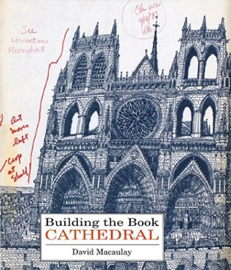
Macaulay writes, “Build­ing up lay­ers of line is what you do when you don’t have col­or to work with. And in 1973, when Cathe­dral was pub­lished, black and white was the only real­is­tic way of pro­duc­ing such a large book by an unknown author/illustrator” (Macaulay, 2010, p. 4). Cathe­dral and Cas­tle are both over­sized for­mat books, but Build­ing the Book Cathe­dral, which is an expla­na­tion of how Macaulay cre­at­ed the book and con­tains all of the con­tents of Cathe­dral, is even larger.

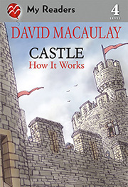
Cathe­dral and Cas­tle are con­sid­ered clas­sics by many, and after the books were in print for over thir­ty years, the pub­lish­er sug­gest­ed updat­ing them in col­or. Macaulay resist­ed the idea of col­oriza­tion, just lay­er­ing col­or over cross-hatch­ing, but he was intrigued by the idea of see­ing the two build­ings in col­or. In less than two years the new full col­or books were com­plet­ed, slight­ly decreased in size from the orig­i­nals. In the iden­ti­cal pref­aces to the new books, Macaulay wrote, “More than half the illus­tra­tions in Cas­tle dis­play lit­tle or no resem­blance to their pre­de­ces­sors. All of Cathe­dral’s illus­tra­tions had been reworked from scratch.” He added, “I updat­ed the infor­ma­tion when­ev­er I could, but what remains con­sis­tent between these new edi­tions and the orig­i­nals is the use of per­spec­tive and dra­mat­ic points of view” (Macaulay, 2010, p.4). Macaulay also cre­at­ed an easy-to-read ver­sion of Cas­tle for his My Read­ers How It Works series. And, while not  full-length motion pic­tures, Cathe­dral and Cas­tle were made into doc­u­men­taries for PBS and aired in the 1980’s. Both can be viewed on YouTube here and here.

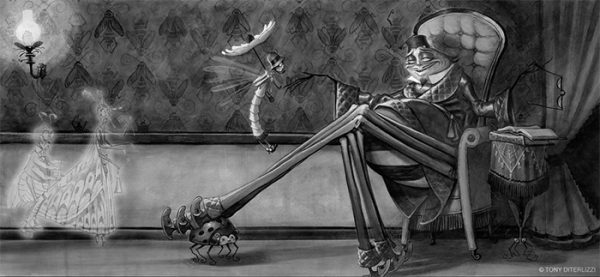
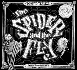
Nei­ther a motion pic­ture nor a tele­vi­sion ver­sion was made of The Spi­der and the Fly (Calde­cott Hon­or, 2003), writ­ten by Mary Howitt and illus­trat­ed by Tony DiTer­l­izzi. How­ev­er, there is a delight­ful ani­mat­ed ver­sion of the book on YouTube here. And, in an essay on his web­site, DiTer­l­izzi writes, “The book’s over­all lay­out was inspired by silent movies of the 1920’s….Ms. Fly was inspired by actress Clara Bow, while Mr. Spi­der was part Peter Lorre and part Gomez Addams, with the charis­ma of Mar­lon Bran­do” (DiTer­l­izzi, 2024). In the illus­tra­tion below, the diag­o­nal line of Mr. Spider’s crossed legs under­scores Ms. Fly and leads the eye to his smarmy visage.

illustration from The Spider and the Fly by Tony DeTerlizzi
illus­tra­tion © Tony DiTer­l­izzi from The Spi­der and the Fly , writ­ten by Mary Howitt and pub­lished by Simon & Schus­ter Books for Young Read­ers (Calde­cott Hon­or, 2003)

It was DiTerlizzi’s idea to draw the illus­tra­tions in black and white. The Asso­ci­a­tion for Library Ser­vice to Chil­dren care­ful­ly describes the media he used: “Lamp black and tita­ni­um white hol­bein Acry­la gouache and Berol Pris­ma­col­or pen­cil on Strath­more 5‑ply, plate Bris­tol board and repro­duced in sil­ver and black duo­tone, graphite, and Adobe Pho­to­shop” (ALSC, 2020, p. 113). They go on to describe the book as “moody…. with all the allure of the flick­er­ing sil­ver screen,” and with “skill­ful use of tone, line, and per­spec­tive.” Ms. Fly, the damsel in dis­tress, becomes more enmeshed in the vil­lain­ous spider’s plot while his web becomes increas­ing­ly more intri­cate until she is final­ly cap­tured at the con­clu­sion of this cau­tion­ary tale, writ­ten in 1829.

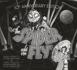
DiTer­l­izzi had the oppor­tu­ni­ty to cre­ate a new 10th anniver­sary jack­et for his book that includes a “movie poster” on the reverse side. The typog­ra­phy of the title looks a lit­tle more movie-like with the inclu­sion of the quo­ta­tion marks, and it match­es the let­ter­ing of the poster on the inside jack­et. Upon win­ning a Calde­cott Hon­or, edi­tor Kevin Lewis of Simon & Schus­ter pro­nounced, “We pre­fer the sil­ver medal, as gold would’ve clashed with the sil­ver duo­tone print­ed in the book” (DiTer­l­izzi, 2004).

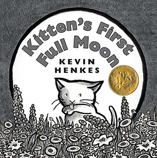
Kitten's First Full Moon by Kevin Henkes

Like The Spi­der and the Fly, an ani­mat­ed ver­sion of Kitten’s First Full Moon (Calde­cott Medal, 2005) was cre­at­ed by Scholas­tic and West­on Woods (in Span­ish) which can be viewed here.

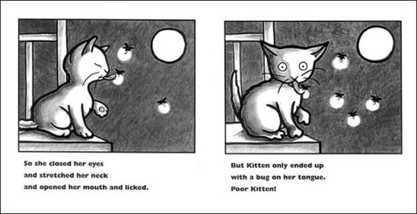
Author/illustrator Kevin Henkes may not have been visu­al­iz­ing his book as a movie when he cre­at­ed it, but he incor­po­rates many action sequence pan­els that lend them­selves to dra­mat­ic ani­ma­tion. In the two-page spread below, Kit­ten is run­ning so quick­ly that she breaks the frame in the last panel.
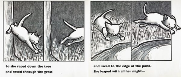
illustration from Kevin Henkes Kitten's First Full Moon
illus­tra­tion © Kevin Henkes from Kit­ten’s First Full Moon, pub­lished by Green­wil­low Books, 2005

In his Calde­cott accep­tance speech, Henkes said, ”I’ve always been drawn to pic­ture books for the youngest child. I love their sim­plic­i­ty and poet­ic nature. When I became a par­ent, this attrac­tion inten­si­fied” (Henkes, 2005, p. 10). Did Henkes know that “Black and white pho­tos with con­trast­ing pat­terns or images … are easy for your infant to focus on and can encour­age their vision devel­op­ment”? (Rymarow­icz, 2014. Para. 4).  Per­haps. He con­tin­ued, “From the start I pic­tured this book with black-and-white illus­tra­tions, bold sans serif type, a square trim size, and soft creamy paper.” He explained, “The art was pre­pared using black gouache for the line and black and gray col­ored pen­cils. But the book was print­ed in four col­ors on a full-col­or press. This gave the illus­tra­tions a rich­ness and depth they wouldn’t have had if the book had been print­ed with black ink only” (Henkes, 2005, p. 11).

illustration from Kevin Henkes' Kitten's First Full Moon
illus­tra­tion © Kevin Henkes from Kit­ten’s First Full Moon, pub­lished by Green­wil­low Books, 2005

The cir­cle is a motif through­out the book with the shape of the moon, the bowl of milk, and the kitten’s wide, expres­sive eyes. Cir­cles also form a pat­tern on the end­pa­pers. The thick black-and white lines appeal to a young child. Henkes said, “.…for this book col­or seemed unnec­es­sary. I thought that by keep­ing every­thing as sim­ple and spare as pos­si­ble, a bet­ter, tighter, more com­plete book would result” (Henkes, 2005, p. 11). For Henkes, it result­ed in a Calde­cott Medal.

Col­or may ini­tial­ly attract read­ers to books, but the black-and-white art­work of these Calde­cott Award books will retain their atten­tion. With each exam­i­na­tion, read­ers will pore over the illus­tra­tions see­ing some­thing new to appre­ci­ate. Black-and white pic­ture books have many advan­tages and can be end­less­ly fascinating.

Picture Books Cited

Henkes, K. (2004). Kitten’s first full moon. Green­wil­low Books.

Howett, M. & DiTer­l­izzi, T. (2002). The spi­der and the fly. Simon & Schus­ter Books for Young Readers.

Macaulay, D. (1973). Cathe­dral: The sto­ry of its con­struc­tion. Houghton Mif­flin.

Macaulay, D. (1977). Cas­tle. Houghton Mifflin.

Macaulay, D. (1999). Build­ing the book Cathe­dral. HMH Books for Young Readers.

Macaulay, D. (2010). Cas­tle. Houghton Mif­flin Har­court Books for Young Readers.

Macaulay, D. (2010). Cathe­dral. Houghton Mif­flin Har­court Books for Young Readers.

Macaulay, D. (2012). Cas­tle: How it works. Square Fish/David Macauley Studios.

Van Alls­burg, C. (1979). The gar­den of Abdul Gasazi. Houghton Mifflin.

Van Alls­burg, C. (1981). Juman­ji. Houghton Mif­flin.

Selznick, B. (2007). The inven­tion of Hugo Cabret. Scholas­tic Press.

References

Asso­ci­a­tion for Library Ser­vice to Chil­dren (ALSC). (2020). The inven­tion of Hugo Cabret. The New­bery and Calde­cott Awards: A guide to the medal and hon­or books. Amer­i­can Library Association.

Carey, J. (2008, Jan­u­ary 12). A sub­tle world in black and white. The Guardian

DiTer­l­izzi, T. (2004). Behind the book: The spi­der and the fly. Tony DiTer­l­izzi: Artist, Author, Worldbuilder. 

Flem­ing Jr., M. (2019, May 30). Fox/Disney lands “The gar­den of Abdul Gasazi” by “Juman­ji” author Chris Van Alls­burg. Dead­line.

Henkes, K. (2005, Summer/Fall). Calde­cott Medal accep­tance. Chil­dren and Libraries, 3(2), 9 – 11.

Horn­ing, K. T. (2012, Novem­ber). Calde­cott in black and white. Book Links, 22(1), 10 – 14.

Hugo. (2011). Inter­net Movie Data­base. 

Macaulay, D. (2010). Pref­ace. In Macaulay, D. (2010). Cathe­dral (pp. 4 – 5). Houghton Mif­flin Har­court Books for Young Readers.

McElmeel, S.L. (2000). 100 most pop­u­lar books for chil­dren. Libraries Unlimited.

Rymanow­icz, K. (2014, Decem­ber 18). Infant vision devel­op­ment: Help­ing babies see their bright futures! Michi­gan State Uni­ver­si­ty Exten­sion. c.

Selznick, B. (2008, Summer/Fall). Calde­cott Medal accep­tance speech: Make the book you want to make. Chil­dren and Libraries, 6(2), 10 – 12.

Van Alls­burg, C., & Heller, S. (2004, November/December). Chris Van Alls­burg, cre­ator, The Polar Express. Print, 58(6), 50, 52, 334.

Wynne-Jones, T. (2017, May/June). BGHB at 50: The gar­den of Abdul Gasazi: A per­son­al reflec­tion. The Horn Book Mag­a­zine, 93(3), 56 – 61.

Subscribe
Notify of
guest

This site uses Akismet to reduce spam. Learn how your comment data is processed.

0 Comments
Oldest
Newest