
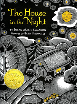
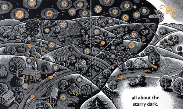
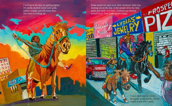
 Minimal use of color can be very powerful. In The House in the Night (Caldecott Medal, 2009), written by Susan Marie Swanson, Beth Krommes highlights her black-and-white scratchboard and watercolor illustrations with a golden orange color.
This warm glow throughout the book is comforting and reassuring amidst the darkness of the night.
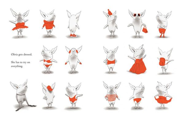
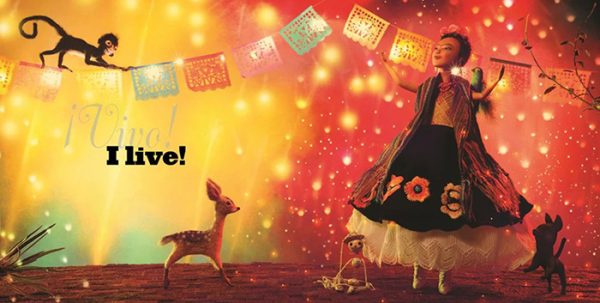
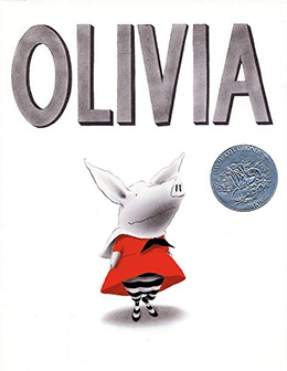 Color has meaning, and can mean different things depending on how it is used. Ian Falconer dresses his irrepressible piglet in red in every illustration in Olivia (Caldecott Honor, 2001). She is brave and bold. Red is often associated with love or power (Cherry, 2025), but it can also symbolize energy, and energy defines Olivia as she tries on every article of clothing she owns in the morning. The multiple vignettes indicate action in rapid succession, and the color red focuses all the attention on Olivia.
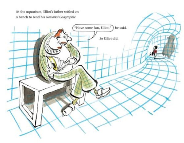
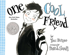 David Small also uses color symbolically in Tony Buzzeo’s One Cool Friend (Caldecott Honor, 2013). Blue is a cool color, and it evokes the idea of water and cold, very appropriate for a story about a penguin. As Elliot walks into the aquarium, the blue tiles and curved tunnel remind you of an igloo. Did you notice that Elliot’s shadow is a penquin?
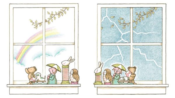
 When you contrast these images with Kevin Henkes’ soft and consistent pastel palette in Waiting (Caldecott Honor, 2016), it’s easy to see how color affects emotion and mood.
The quiet calmness of the waiting toys in Henkes’ picture book makes it a perfect choice for a soothing bedtime story.
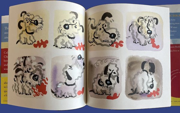
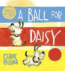 Chris Raschka masterfully captures a dog’s emotions after her ball deflates in A Ball for Daisy (Caldecott Medal, 2012). Not only does Raschka illustrate Daisy’s bewilderment, anger, and sorrow in the dog’s expressions, but he also emphasizes her grief journey from disbelief to depression through the background colors gradually shifting from yellow to purple to brown. In this two-page spread, he demonstrates a quote from Picasso: “Colors, like features, follow the changes of the emotions” (Cherry, 2025).
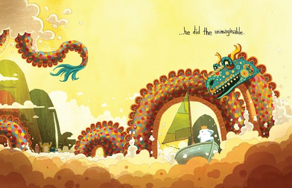
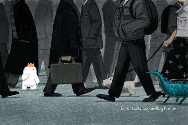
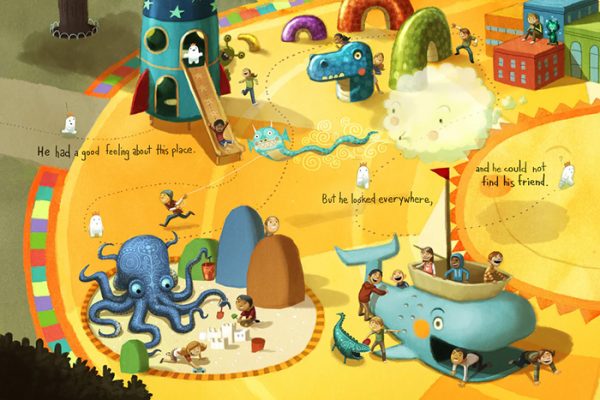
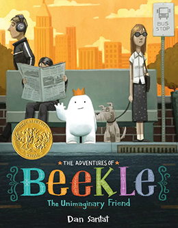 Dan Santat creates mood and also defines setting through color in The Adventures of Beekle: The Unimaginary Friend (Caldecott Medal, 2015). In the first illustration, we find Beekle in the childhood world of imagination, a kaleidoscope of color. The bright yellow, a color associated with happiness, dominates. However, when Beekle enters the adult world, the somber dark colors indicate the seriousness of the grown-ups. Santat distinguishes between the two worlds again in the third illustration. Beekle runs from gray to color entering the exuberance of children’s imaginations on the playground.
What a marvelous article with so many inspiriting books as examples. Thank you, Heidi and Gail.
Thank you!
Wonderful article! Thank you. That deep connection to color persists; I just helped 5th graders write color poems with and they adored it!
That’s great! Thank you!